Tuesday, 15 February 2011
D&AD
These are my finished label designs for the D&AD brief, the idea here is that the labels look like boarding passes to highlight the idea that the ingredients that go into The Body Shop's products come from all over the world.


Monday, 6 December 2010
Research Project

I have changed the pink, to this blue and left all the backgrounds to just white.

Helvetica Neue Ultra Light Yes, used this typeface as it is clear and understandable and the english language is one of the most spoken languages.

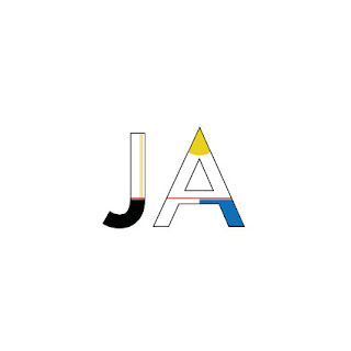
Bauhaus inspirsed JA for my German card, maybe it should be slightly bigger?
31 Things cont.
Wednesday, 1 December 2010
Sunday, 25 April 2010
Saturday, 3 April 2010
Alphabet
Subscribe to:
Posts (Atom)


a(2).jpg)